- What you're looking at when you open a chart
- Reading a single candlestick: body, wicks, and what the color means
- Timeframes: why the same candle means something different depending on the window
- Volume: the number that tells you whether a move is real
- Support and resistance: the zones price keeps bouncing off
- Trend: how to tell whether the market is actually going somewhere
- The handful of indicators worth learning first
- Chart patterns: the shapes worth recognizing first
- What a chart can't tell you
- Frequently Asked Questions
How to Read Crypto Trading Charts: A Beginner’s Walkthrough, Step by Step
When you first look at a crypto chart, it can be overwhelming: there’s a jagged line, a wall of red and green blocks, and numbers changing rapidly.
You might learn the terminology—such as candlestick, RSI, support, and resistance—but still find yourself staring at your own chart with no clear insights.
This isn’t just a lack of knowledge; it’s a problem with the sequence of learning. No one guides you through the process of choosing a timeframe, reading the trend, marking a level, checking volume, and confirming with an indicator—in that order—using an actual chart from start to finish.
This guide addresses that gap and includes a complete worked example to demonstrate the sequence in practice.
What you’re looking at when you open a chart
A crypto trading chart displays how the price of a crypto asset has changed over a specific period. Time is represented on the horizontal axis, while price is shown on the vertical axis. There are four common types of charts:
1. Line Charts
These charts connect closing prices from one period to the next with a line. They provide a quick overview of price direction but do not include the highs and lows within each period.
2. Candlestick Charts
Each candlestick displays four key prices for each period: the open, high, low, and close. This type of chart offers traders more detailed information about price movement at a glance.
3. Bar Charts
Similar to candlestick charts, these show the same four prices (open, high, low, and close) but use vertical bars with small ticks to indicate the open and close prices.
4. Heikin-Ashi Charts
This chart type uses modified price calculations to smooth out price movements, making trends easier to identify. While useful for spotting trends, it does not display exact market prices like standard candlestick charts do.
Candlestick charts are widely used because they show the open, high, low, and close prices all at once.
Line charts can be helpful for a quick view of the price direction. While bar and Heikin-Ashi charts are useful to know about, they are generally not necessary for most traders.
Reading a single candlestick: body, wicks, and what the color means
A candlestick represents the price movements of a crypto asset over a specific period. For instance, on a 1-hour chart, each candlestick corresponds to one hour, while on a daily chart, it represents one day
Each candlestick provides four key prices: open, high, low, and close. The open is the starting price for the period, the close is the ending price, the high is the highest price reached, and the low indicates the lowest price.
Essentially, a candlestick reflects the tension between buyers and sellers during that time.
The body of the candlestick is between the open and close prices, while the thin lines above and below, known as wicks or shadows, indicate price movements outside the body. The upper wick shows how high the price rose, and the lower wick shows how far it fell.
Candlestick color reveals sentiment: a green or white candle means the close was higher than the open, while a red or black candle means it was lower.
For example, if a cryptocurrency opens at $61,200, reaches a high of $62,800, falls to $60,900, and closes at $62,400, it forms a green candle.
The body extends from $61,200 to $62,400, with the upper wick showing buyer strength pushing the price up and the lower wick indicating some downward movement before buyers regained control.
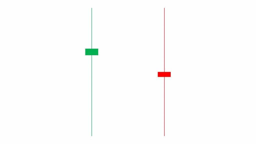
The shape of a candle provides additional insight. A tall body with short wicks indicates that one side controlled the price action for most of the period.
Conversely, a small body with long wicks on both sides suggests that the price fluctuated significantly in both directions, but neither side gained the upper hand by the close, resulting in a draw.
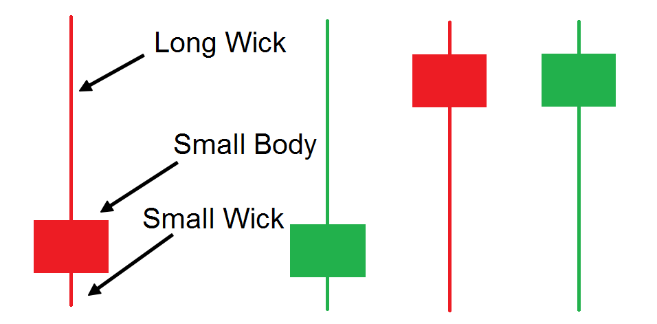
However, one candle alone does not tell the entire story. Its significance becomes clearer when you compare it to the surrounding candles, the broader trend, and nearby price levels.
Timeframes: why the same candle means something different depending on the window
A timeframe shows how long each candle represents on a chart. For instance, a 1-minute chart has candles for one minute, while a daily chart represents an entire day.
Shorter timeframes (1-minute, 5-minute, 15-minute) are best for scalpers and day traders tracking small price movements. Longer timeframes (4-hour, daily, weekly) help traders understand broader market trends and plan swing trades or longer-term positions.
The same market move can appear quite different depending on the timeframe. A sharp drop on a 15-minute chart may seem alarming, but if you look at the daily chart, that same drop could be just a typical pullback within a larger uptrend.
A practical approach is to analyze the charts from top to bottom. Start with the daily chart to identify the overall trend and key levels. Then, move to the 4-hour chart to refine those levels further.
Only shift to the 1-hour or 15-minute chart to time your actual entry. If the smaller timeframe contradicts the larger timeframe, the larger one typically takes precedence; a few candles on a smaller chart are seldom sufficient to confirm a genuine reversal.
Volume: the number that tells you whether a move is real
Price reflects a cryptocurrency’s movement direction, while volume indicates the trading activity during that movement. Volume is usually shown as vertical bars below the price chart, where tall bars represent high trading activity and short bars indicate low activity.
The color of the volume bars typically matches the price candles: green for price increases and red for decreases, allowing for a quick assessment of direction and conviction.
Volume is most meaningful in relation to price. For instance, if Bitcoin breaks above a resistance level with a significant increase in volume, it suggests strong trader participation. Conversely, a breakout on low volume is less convincing and more likely to reverse.
This applies to trends as well. Rising prices accompanied by high volume indicate healthy participation, while price increases on declining volume should raise caution.
Ultimately, volume shows whether there is genuine activity behind a price movement, so always assess price first, then check volume for support.
Support and resistance: the zones price keeps bouncing off
Support is a price range where a cryptocurrency typically attracts buyers after a decline, while resistance is where selling pressure tends to halt an upward movement. Think of both as zones rather than exact lines.
For example, Bitcoin may find buyers around $60,000 but can dip below that level before bouncing back, and the same applies to resistance.
These levels are important because traders remember how prices reacted in these areas in the past, leading them to place orders around the same zones again. This collective memory is part of why these levels continue to be effective.
You can identify potential support and resistance by looking for areas where the price has frequently reversed, paused, or struggled to move through. The more clearly the price reacts at a specific level, the more significance it holds.
Support and resistance can also reverse their roles. When a price convincingly breaks above a resistance level, that zone can become support when the price returns to test it.
Conversely, if the price breaks below a support level, that former support can turn into resistance.
Not every previous high or low should be labeled as significant. Focus on zones that the price has tested multiple times, especially on larger timeframes.
Once these levels are identified, they provide context for the rest of the chart: a move towards resistance has different implications than the same move occurring in a clear space.
Trend: how to tell whether the market is actually going somewhere
Before analyzing a chart, observe the price’s direction over time. The market generally exists in one of three states: an uptrend, a downtrend, or a range.
In an uptrend, prices form higher highs and higher lows, with each pullback stopping at a higher level. In a downtrend, prices create lower highs and lower lows. When neither side dominates, the market moves sideways.
This structure provides context for individual candles. In an uptrend, a sharp red candle may just signal a pullback, not a bearish reversal. Similarly, a green candle in a downtrend doesn’t automatically indicate a change.
Beginners often mistake movements against the trend as reversals. A trend typically requires more than one candle to change direction, so look for follow-through and shifts in the overall pattern.
Always check larger timeframes, as the daily trend usually holds more importance than smaller charts.
The handful of indicators worth learning first
Indicators are mathematical tools that analyze price or volume data to help you identify trends, momentum, volatility, and potential turning points.
They should complement your chart analysis rather than replace it. Start with these four key indicators:
- Moving Average: This indicator smooths out price data, making it easier to discern the underlying trend. Simple moving averages treat all periods equally, while exponential moving averages give more weight to recent prices.
- Relative Strength Index (RSI): This measures the strength of recent price changes on a scale from 0 to 100. Readings above 70 are typically considered overbought, and readings below 30 are seen as oversold. However, neither condition guarantees that a reversal is imminent.
- Moving Average Convergence Divergence (MACD): This indicator compares moving averages to highlight changes in momentum. Traders often look for the MACD line to cross above or below its signal line as a potential trading signal.
- Bollinger Bands: This tool consists of an upper and lower band around a moving average. The bands expand when volatility increases and contract when volatility decreases.
As you continue your analysis, you may encounter additional indicators worth exploring, such as the Stochastic Oscillator, Fibonacci retracement, Average True Range, and trendlines.
Before delving into these more complex indicators, make sure you are comfortable interpreting price action, volume, trends, and support and resistance levels using the four key indicators listed above.
Chart patterns: the shapes worth recognizing first
Chart patterns are recurring price structures that help traders predict future market movements. They are easier to understand with knowledge of candlesticks, trends, volume, and key levels.
Patterns fall into three main categories:
- Continuation Patterns: Suggest the trend will resume after a pause.
- Reversal Patterns: Indicate the current trend may be weakening.
- Bilateral Patterns: Can break in either direction; confirmation is needed before
- acting.
Focus on these four key patterns:
- Double Top: Price hits a similar high twice and drops below the support level (neckline) between peaks. A return above this level weakens the pattern.
- Double Bottom: Price dips to a similar low twice, then rises. A breach above the resistance between the lows confirms the pattern. Falling below that level weakens it.
- Head and Shoulders: Consists of three peaks, with the middle one higher. A break below the neckline can confirm a bearish reversal, while reclaiming it weakens the setup.
- Triangle: Price moves within narrowing highs and lows. Wait for a clear break of the boundary before interpreting as a signal.
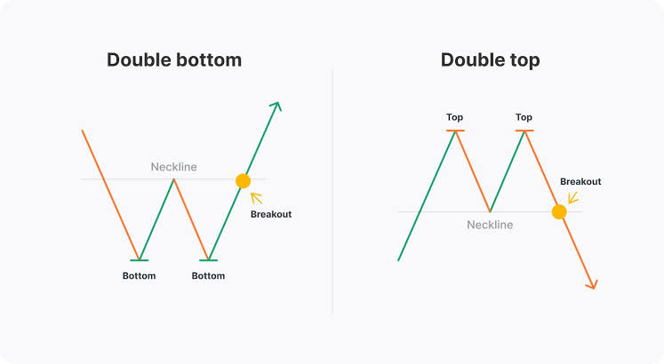
A clean break of any of these levels is more significant when it occurs with stronger-than-usual volume, as opposed to happening on weak activity.
These four levels are just a starting point; there are many other named patterns that are worth exploring once you feel comfortable with these.
What a chart can’t tell you
A chart reflects past prices and trading activity, but it cannot predict future market changes. Factors such as regulatory announcements can cause a cryptocurrency’s value to fluctuate sharply within minutes.
Additionally, breaking news, significant protocol events, the movement of a large wallet, or a sudden shift in overall market sentiment can all disrupt the patterns you were observing, often without warning.
Technical analysis relies on the information already available in market data. However, when new information enters the market, traders often react before a chart pattern has had a chance to develop fully.
For example, you might identify what appears to be a clear breakout above resistance, with price, volume, and indicators all aligning, but it can still fail within minutes due to a negative announcement arriving simultaneously.
This doesn’t render chart reading ineffective; instead, it indicates that while chart analysis helps narrow down probabilities, it cannot eliminate uncertainty entirely.
A skilled chart reader understands what the chart indicates and recognizes when external factors may carry more weight.
Frequently Asked Questions
What is a crypto chart?
A crypto chart displays the price movement of a cryptocurrency over a selected period. It allows you to quickly visualize price trends, movements, and potential patterns.
What do the different lines and candles mean on a crypto chart?
Lines represent price movement over time in a simplified manner, while candlesticks provide information about the opening, closing, highest, and lowest prices for each period.
Can crypto charts predict future prices?
No, crypto charts cannot predict future prices with certainty. While they can help identify trends, patterns, and possible support or resistance levels, price movements can change unexpectedly due to news, market sentiment, and shifts in liquidity—factors that charts cannot anticipate in advance.
Do I need a specific platform to practice this?
Most cryptocurrency exchanges come with built-in charts, and free tools like TradingView are compatible with almost any coin. The steps in this guide can be applied in the same way, regardless of where you are viewing the chart.